Images of the charts are at the end of this tutorial.
Let’s explore how to use Python and Dash to create a series of insightful charts from an Excel file. Download the excel with dummy data here: https://go.microsoft.com/fwlink/?LinkID=521962. Once downloaded, move the file to C:/Financial Sample.xlsx.

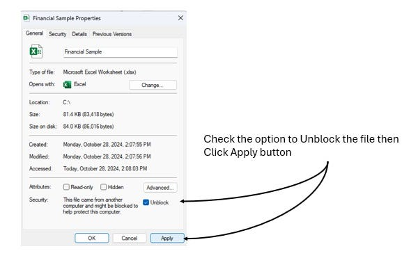
Unblock the file:

We’ll generate several charts to analyze sales trends, country performance, product popularity, and more. Dash allows us to create interactive and visually appealing charts, making it a great choice for exploring or showcasing our data.
We’ll cover each chart, explaining the code and discussing why each chart type is appropriate. Let’s dive in!
Project Setup
Create a new folder called FinancialDashApp. Enter into that folder and create a virtual environment (venv).
Navigate to the FinancialDashApp directory in your terminal:
cd C:\FinancialDashAppCreate the virtual environment:
python -m venv venvActivate the virtual environment:
On Windows:
venv\Scripts\activateOn macOS/Linux:
source venv/bin/activateCreate an empty file named: app.py in the folder so that your directory looks like this:
FinancialDashApp/
├── app.py
└── venv/- app.py: Our main file to load data and build Dash components.
- C:/Financial Sample.xlsx: Our data source.
Install Python Packages:
pip install pandas dash plotly openpyxl statsmodels- pandas: Used for data manipulation.
- dash: A web framework for interactive data visualization.
- plotly: Power behind Dash’s charts.
- openpyxl: Reads Excel files in pandas.
- statsmodels: OLS calculations under the hood for trendlines.
Loading the Data
Open app.py and start by importing necessary libraries and loading the Excel file.
import pandas as pd
from dash import Dash, dcc, html
import plotly.express as px

# Load the Excel data
file_path = 'C:/Financial Sample.xlsx'
df = pd.read_excel(file_path, engine='openpyxl')

# Rename the ' Sales' column to 'Sales' (removing the leading space)
df = df.rename(columns={' Sales': 'Sales'})

# Initialize the Dash app
app = Dash(__name__)
app.title = "Financial Dashboard"
In the above code, take note of this heading: # Rename the ‘ Sales’ column to ‘Sales’ (removing the leading space).
Pandas expects the column names to be perfect matches. It just so happens that the .xlxs from Microsoft has column J named ‘ Sales’ with a leading space. The code below shows how I determined what pandas was importing as column names.
# columncheck.py
import pandas as pd

# Load the Excel data
file_path = 'C:/Financial Sample.xlsx'
df = pd.read_excel(file_path, engine='openpyxl')

# Print the column names to verify
print(df.columns)
Result of code above (note space in ‘ Sales’):
(venv) PS C:\FinancialDashApp> python columncheck.py
Index(['Segment', 'Country', 'Product', 'Discount Band', 'Units Sold',
       'Manufacturing Price', 'Sale Price', 'Gross Sales', 'Discounts',
       ' Sales', 'COGS', 'Profit', 'Date', 'Month Number', 'Month Name',
       'Year'],
      dtype='object')
(venv) PS C:\FinancialDashApp>
The column name is normalized using this bit of code in the app.py file.
df = df.rename(columns={' Sales': 'Sales'})NOTE: The initial code snippets below are standalone examples that help you understand how to create each chart individually. However, to include all the charts in a single app, these standalone snippets will be combined into a full app.py file, as shown in the final code section at the end of this article.
1. Sales by Segment
Purpose
This chart compares total sales for each segment (e.g., Government, Midmarket). A bar chart is perfect for this because it’s great at showing categorical data.
Standalone Code
# Aggregate sales by segment
sales_by_segment = df.groupby('Segment')['Sales'].sum().reset_index()

# Create the chart
segment_fig = px.bar(
    sales_by_segment,
    x='Segment',
    y='Sales',
    title='Sales by Segment',
    labels={'Sales': 'Total Sales'},
    color='Segment',
    text='Sales'
)
segment_fig.update_layout(showlegend=False)
segment_fig.update_yaxes(tickformat="$,.2f")  # Format y-axis as currency

# Update hover and text templates for dollar formatting
segment_fig.update_traces(
    texttemplate='%{text:$,.2f}',  # Format text on bars as currency
    hovertemplate='%{y:$,.2f}'     # Format hover labels as currency
)

# Adding the chart to the Dash layout
app.layout = html.Div([
    html.H1("Financial Dashboard"),
    dcc.Graph(id='sales-by-segment', figure=segment_fig),
])
Explanation
The groupby() function aggregates sales by segment. The px.bar function from Plotly Express makes the bar chart. Setting text='Sales' adds value labels for readability.
tickformat="$,.2f": Ensures y-axis labels display in dollar format with commas for thousands and two decimal places.texttemplate='%{text:$,.2f}': Formats the values displayed on top of the bars as currency.hovertemplate='%{y:$,.2f}': Formats hover labels to show values in dollar format.
2. Sales by Country
Purpose
This chart breaks down sales by country, revealing the strongest markets. A bar chart also works well here.
Standalone Code
# Aggregate sales by country
sales_by_country = df.groupby('Country')['Sales'].sum().reset_index()

# Create the chart
country_fig = px.bar(
    sales_by_country,
    x='Country',
    y='Sales',
    title='Sales by Country',
    labels={'Sales': 'Total Sales'},
    color='Country'
)
country_fig.update_layout(showlegend=False)
country_fig.update_yaxes(tickformat="$,.2f")  # Format y-axis as currency

# Update hover and text templates for dollar formatting
country_fig.update_traces(
    texttemplate='%{y:$,.2f}',  # Format text on bars as currency
    hovertemplate='%{y:$,.2f}'  # Format hover labels as currency
)

# Update the layout to include both charts
app.layout = html.Div([
    dcc.Graph(id='sales-by-segment', figure=segment_fig),
    dcc.Graph(id='sales-by-country', figure=country_fig)
])
Explanation
We added a dcc.Graph component to display this chart under the “Sales by Segment” chart. This chart shares a similar format for clarity and consistency.
tickformat="$,.2f": Ensures the y-axis displays values in dollar format.texttemplate='%{y:$,.2f}': Formats the bar text (displayed directly on the bars) as currency.hovertemplate='%{y:$,.2f}': Formats the hover labels to show values as currency.
3. Monthly Sales Trend
Purpose
This line chart shows how sales fluctuate each month. Line charts are ideal for continuous time series data, such as monthly sales.
Standalone Code
# Aggregate monthly sales
monthly_sales = df.groupby('Month Name')['Sales'].sum().reindex([
    'January', 'February', 'March', 'April', 'May', 'June', 'July',
    'August', 'September', 'October', 'November', 'December'
]).reset_index()

# Create the line chart
monthly_fig = px.line(
    monthly_sales,
    x='Month Name',
    y='Sales',
    title='Monthly Sales Trend',
    labels={'Sales': 'Total Sales'},
    markers=True
)
monthly_fig.update_yaxes(tickformat="$,.2f")  # Format y-axis as currency

# Update hover template for dollar format in hover
monthly_fig.update_traces(
    hovertemplate='%{y:$,.2f}'  # Format hover labels as currency
)

# Define the layout with all charts
app.layout = html.Div([
    dcc.Graph(id='sales-by-segment', figure=segment_fig),
    dcc.Graph(id='sales-by-country', figure=country_fig),
    dcc.Graph(id='monthly-sales-trend', figure=monthly_fig)
])
Explanation
The reindex() function arranges months in chronological order, ensuring a smooth flow.
tickformat="$,.2f": Formats the y-axis as currency.hovertemplate='%{y:$,.2f}': Customizes the hover labels to show Sales values in dollar format.
4. Yearly Sales Growth
Purpose
A bar chart displays sales growth by year. This chart reveals growth patterns over time, making it easy to track annual performance.
Standalone Code
# Aggregate yearly sales
yearly_sales = df.groupby('Year')['Sales'].sum().reset_index()

# Create the bar chart
yearly_fig = px.bar(
    yearly_sales,
    x='Year',
    y='Sales',
    title='Yearly Sales Growth',
    labels={'Sales': 'Total Sales'},
    text='Sales'
)
yearly_fig.update_yaxes(tickformat="$,.2f")  # Format y-axis as currency

# Update hover and text templates for dollar formatting
yearly_fig.update_traces(
    texttemplate='%{text:$,.2f}',  # Format text on bars as currency
    hovertemplate='%{y:$,.2f}'     # Format hover labels as currency
)

# Define the layout with all charts
app.layout = html.Div([
    dcc.Graph(id='sales-by-segment', figure=segment_fig),
    dcc.Graph(id='sales-by-country', figure=country_fig),
    dcc.Graph(id='monthly-sales-trend', figure=monthly_fig),
    dcc.Graph(id='yearly-sales-growth', figure=yearly_fig)
])
Explanation
tickformat="$,.2f": Formats the y-axis as currency.texttemplate='%{text:$,.2f}': Ensures the values displayed on top of the bars are shown in dollar format.hovertemplate='%{y:$,.2f}': Customizes the hover labels to display Sales values in dollar format.
5. Gross Sales vs. Profit by Segment
Purpose
This stacked bar chart compares gross sales with profits for each segment, helping identify profitability.
Standalone Code
# Calculate gross sales and profit by segment
segment_sales_profit = df.groupby('Segment')[['Gross Sales', 'Profit']].sum().reset_index()

# Create the stacked bar chart
sales_profit_fig = px.bar(
    segment_sales_profit,
    x='Segment',
    y=['Gross Sales', 'Profit'],
    title='Gross Sales vs. Profit by Segment',
    labels={'value': 'Amount', 'variable': 'Metric'},
    text_auto=True  # Automatically adds values on top of bars
)
sales_profit_fig.update_yaxes(tickformat="$,.2f")  # Format y-axis as currency

# Update text and hover templates for correct currency formatting
sales_profit_fig.update_traces(
    texttemplate='%{value:$,.2f}',  # Use value placeholder to format numbers on bars as currency
    hovertemplate='%{y:$,.2f}'      # Format hover labels as currency
)

# Define the layout with all charts
app.layout = html.Div([
    dcc.Graph(id='sales-by-segment', figure=segment_fig),
    dcc.Graph(id='sales-by-country', figure=country_fig),
    dcc.Graph(id='monthly-sales-trend', figure=monthly_fig),
    dcc.Graph(id='yearly-sales-growth', figure=yearly_fig),
    dcc.Graph(id='sales-profit-comparison', figure=sales_profit_fig)
])
Explanation
tickformat="$,.2f": Formats the y-axis as currency.texttemplate='%{value:$,.2f}': Formats the values displayed on the bars as currency by using thevalueplaceholder, which works well for multi-category bars likeGross SalesandProfit.hovertemplate='%{y:$,.2f}': Ensures that hover labels show values in dollar format.
6. Discount Impact on Sales
Purpose
A scatter plot examines how discounts affect sales. It helps in visualizing correlation between the two variables.
Standalone Code
# Create scatter plot for discounts vs. sales
discount_sales_fig = px.scatter(
    df,
    x='Discounts',
    y='Sales',
    title='Discount Impact on Sales',
    labels={'Discounts': 'Discount Amount', 'Sales': 'Sales Amount'},
    trendline='ols'
)
discount_sales_fig.update_yaxes(tickformat="$,.2f")  # Format y-axis as currency

# Update hover template for dollar format in hover labels
discount_sales_fig.update_traces(
    hovertemplate='%{y:$,.2f}'  # Format hover labels for Sales as currency
)

# Define the layout with all charts
app.layout = html.Div([
    dcc.Graph(id='sales-by-segment', figure=segment_fig),
    dcc.Graph(id='sales-by-country', figure=country_fig),
    dcc.Graph(id='monthly-sales-trend', figure=monthly_fig),
    dcc.Graph(id='yearly-sales-growth', figure=yearly_fig),
    dcc.Graph(id='sales-profit-comparison', figure=sales_profit_fig),
    dcc.Graph(id='discount-impact', figure=discount_sales_fig)
])
Explanation
tickformat="$,.2f": Formats the y-axis as currency.hovertemplate='%{y:$,.2f}': Customizes the hover labels to display Sales values in dollar format.
7. Units Sold by Product and Segment
Purpose
This grouped bar chart highlights units sold by each product within different segments, showing demand distribution.
Standalone Code
# Aggregate units sold by product and segment
units_sold = df.groupby(['Product', 'Segment'])['Units Sold'].sum().reset_index()

# Create grouped bar chart
units_sold_fig = px.bar(
    units_sold,
    x='Segment',
    y='Units Sold',
    color='Product',
    barmode='group',
    title='Units Sold by Product and Segment'
)

# Optionally, customize hover labels for clarity
units_sold_fig.update_traces(
    hovertemplate='Product: %{color}<br>Units Sold: %{y}'  # Clarify the product and units sold in hover
)

# Define the layout with all charts
app.layout = html.Div([
    dcc.Graph(id='sales-by-segment', figure=segment_fig),
    dcc.Graph(id='sales-by-country', figure=country_fig),
    dcc.Graph(id='monthly-sales-trend', figure=monthly_fig),
    dcc.Graph(id='yearly-sales-growth', figure=yearly_fig),
    dcc.Graph(id='sales-profit-comparison', figure=sales_profit_fig),
    dcc.Graph(id='discount-impact', figure=discount_sales_fig),
    dcc.Graph(id='units-sold', figure=units_sold_fig)
])
Explanation
hovertemplate='Product: %{color}<br>Units Sold: %{y}': This optional customization clarifies the product name and units sold in the hover label for better readability.
8. Sales Distribution by Month
Purpose
This heatmap shows sales distribution across months. It’s great for spotting high-sales months across all years.
Standalone Code
# Aggregate monthly sales by year
monthly_sales_year = df.pivot_table(
    index='Month Name',
    columns='Year',
    values='Sales',
    aggfunc='sum'
).reindex([
    'January', 'February', 'March', 'April', 'May', 'June', 'July',
    'August', 'September', 'October', 'November', 'December'
])

# Create heatmap
month_sales_fig = px.imshow(
    monthly_sales_year,
    title='Sales Distribution by Month',
    labels=dict(x="Year", y="Month", color="Sales Amount")
)
month_sales_fig.update_coloraxes(colorbar_tickformat="$,.2f")  # Format color bar as currency

# Define the layout with all charts
app.layout = html.Div([
    dcc.Graph(id='sales-by-segment', figure=segment_fig),
    dcc.Graph(id='sales-by-country', figure=country_fig),
    dcc.Graph(id='monthly-sales-trend', figure=monthly_fig),
    dcc.Graph(id='yearly-sales-growth', figure=yearly_fig),
    dcc.Graph(id='sales-profit-comparison', figure=sales_profit_fig),
    dcc.Graph(id='discount-impact', figure=discount_sales_fig),
    dcc.Graph(id='units-sold', figure=units_sold_fig),
    dcc.Graph(id='sales-distribution', figure=month_sales_fig)
])
Explanation
colorbar_tickformat="$,.2f": Formats the color bar in the heatmap as currency, ensuring Sales Amount values are displayed in dollar format with commas and two decimal places.
Final Code: Combining All Charts in app.py
Now that we’ve seen each chart’s code separately, let’s put them all together into a single app.py file. This final code block includes all charts in the app.layout, making it a complete and fully functional Dash application.
# app.py
# Import libraries
import pandas as pd
from dash import Dash, dcc, html
import plotly.express as px

# Load the Excel data
file_path = 'C:/Financial Sample.xlsx'
df = pd.read_excel(file_path, engine='openpyxl')

# Rename the ' Sales' column to 'Sales' (removing the leading space)
df = df.rename(columns={' Sales': 'Sales'})

# Initialize the Dash app
app = Dash(__name__)
app.title = "Financial Dashboard"

# 1. Sales by Segment
sales_by_segment = df.groupby('Segment')['Sales'].sum().reset_index()
segment_fig = px.bar(
    sales_by_segment,
    x='Segment',
    y='Sales',
    title='Sales by Segment',
    labels={'Sales': 'Total Sales'},
    color='Segment',
    text='Sales'
)
segment_fig.update_layout(showlegend=False)
segment_fig.update_yaxes(tickformat="$,.2f")

# Update hover template for dollar format in hover
segment_fig.update_traces(
    texttemplate='%{text:$,.2f}',  # Format the text on the bars as currency
    hovertemplate='%{y:$,.2f}'     # Format the hover label as currency
)

# 2. Sales by Country
sales_by_country = df.groupby('Country')['Sales'].sum().reset_index()
country_fig = px.bar(
    sales_by_country,
    x='Country',
    y='Sales',
    title='Sales by Country',
    labels={'Sales': 'Total Sales'},
    color='Country'
)
country_fig.update_layout(showlegend=False)
country_fig.update_yaxes(tickformat="$,.2f")

# 3. Monthly Sales Trend
monthly_sales = df.groupby('Month Name')['Sales'].sum().reindex([
    'January', 'February', 'March', 'April', 'May', 'June', 'July',
    'August', 'September', 'October', 'November', 'December'
]).reset_index()
monthly_fig = px.line(
    monthly_sales,
    x='Month Name',
    y='Sales',
    title='Monthly Sales Trend',
    labels={'Sales': 'Total Sales'},
    markers=True
)
monthly_fig.update_yaxes(tickformat="$,.2f")

# 4. Yearly Sales Growth
yearly_sales = df.groupby('Year')['Sales'].sum().reset_index()
yearly_fig = px.bar(
    yearly_sales,
    x='Year',
    y='Sales',
    title='Yearly Sales Growth',
    labels={'Sales': 'Total Sales'},
    text='Sales'
)
yearly_fig.update_yaxes(tickformat="$,.2f")
yearly_fig.update_traces(texttemplate='%{text:$,.2f}')  # Format text as currency

# 5. Gross Sales vs. Profit by Segment
segment_sales_profit = df.groupby('Segment')[['Gross Sales', 'Profit']].sum().reset_index()
sales_profit_fig = px.bar(
    segment_sales_profit,
    x='Segment',
    y=['Gross Sales', 'Profit'],
    title='Gross Sales vs. Profit by Segment',
    labels={'value': 'Amount', 'variable': 'Metric'},
    text_auto=True  # Automatically adds values on top of bars
)
sales_profit_fig.update_yaxes(tickformat="$,.2f")

# Update text template for correct currency formatting
sales_profit_fig.update_traces(
    texttemplate='%{value:$,.2f}',  # Use value placeholder to format numbers as currency
    hovertemplate='%{y:$,.2f}'      # Format hover label as currency
)

# 6. Discount Impact on Sales
discount_sales_fig = px.scatter(
    df,
    x='Discounts',
    y='Sales',
    title='Discount Impact on Sales',
    labels={'Discounts': 'Discount Amount', 'Sales': 'Sales Amount'},
    trendline='ols'
)
discount_sales_fig.update_yaxes(tickformat="$,.2f")

# 7. Units Sold by Product and Segment
units_sold = df.groupby(['Product', 'Segment'])['Units Sold'].sum().reset_index()
units_sold_fig = px.bar(
    units_sold,
    x='Segment',
    y='Units Sold',
    color='Product',
    barmode='group',
    title='Units Sold by Product and Segment'
)

# 8. Sales Distribution by Month
monthly_sales_year = df.pivot_table(
    index='Month Name',
    columns='Year',
    values='Sales',
    aggfunc='sum'
).reindex([
    'January', 'February', 'March', 'April', 'May', 'June', 'July',
    'August', 'September', 'October', 'November', 'December'
])
month_sales_fig = px.imshow(
    monthly_sales_year,
    title='Sales Distribution by Month',
    labels=dict(x="Year", y="Month", color="Sales Amount")
)
month_sales_fig.update_coloraxes(colorbar_tickformat="$,.2f")

# Define the layout of the Dash app
app.layout = html.Div([
    html.H1("Financial Dashboard"),
    dcc.Graph(id='sales-by-segment', figure=segment_fig),
    dcc.Graph(id='sales-by-country', figure=country_fig),
    dcc.Graph(id='monthly-sales-trend', figure=monthly_fig),
    dcc.Graph(id='yearly-sales-growth', figure=yearly_fig),
    dcc.Graph(id='sales-profit-comparison', figure=sales_profit_fig),
    dcc.Graph(id='discount-impact', figure=discount_sales_fig),
    dcc.Graph(id='units-sold', figure=units_sold_fig),
    dcc.Graph(id='sales-distribution', figure=month_sales_fig)
])

# Run the Dash app
if __name__ == '__main__':
    app.run_server(debug=True)
Running the Dashboard
Run the Dash app from the terminal:
python app.pyNavigate to http://127.0.0.1:8050 in your browser to see your interactive dashboard with each chart we created.
Here’s a breakdown of the different chart types:
Bar Charts
- Sales by Segment: Shows total sales by segment (e.g., Government, Midmarket) to compare sales across categories.

- Sales by Country: Displays total sales by country, ideal for comparing performance across different geographic regions.

- Yearly Sales Growth: Displays total sales by year to analyze growth trends over time.

- Gross Sales vs. Profit by Segment: A stacked bar chart compares gross sales and profit for each segment, making it easy to see both values side-by-side.

- Units Sold by Product and Segment: A grouped bar chart breaks down units sold by each product within each segment, illustrating demand distribution.

Line Chart
- Monthly Sales Trend: Shows how sales change month-to-month. Line charts are great for displaying trends over a continuous timeline.

Scatter Plot
- Discount Impact on Sales: Examines the relationship between discounts and sales, using a trendline to highlight any correlation. Scatter plots are effective for visualizing the relationship between two variables.

Heatmap
- Sales Distribution by Month: Shows monthly sales distribution across multiple years, with color intensity indicating sales volume. Heatmaps are useful for identifying patterns and seasonal trends.

Each chart type was chosen to provide the clearest and most informative view of the specific data, making it easier to interpret key financial insights.
Thank you for following along with this tutorial. We hope you found it helpful and informative. If you have any questions, or if you would like to suggest new Python code examples or topics for future tutorials/articles, please feel free to join and comment. Your feedback and suggestions are always welcome!
You can find the same tutorial on Medium.com.


