Edgar Howell published an article, along with a youtube video on the essential skills needed to excel as a data scientist. The basis of the article: Insights from 15 Data Scientist across various companies and industries.
In that article, Python was the fourth skill needed after mathematics, communication, and machine learning.
Knowing that Python serves as the foundation for implementing the first three skills, this article delves into an example of using Python for Exploratory Data Analysis.
Setting Up the Environment
Before diving into the code, create a virtual environment to keep the project dependencies isolated.
On Windows:
python -m venv venv
venv\Scripts\activate
pip install pandas matplotlib seaborn notebook
On Linux:
python3 -m venv venv
source venv/bin/activate
pip install pandas matplotlib seaborn notebook
notebook installs several additional packages such as jupyter-core, jupyter-client, ipykernel, and can take a few minutes to complete.
Create the folder structure below:
churn_analysis/
│
├── data/
│   └── customer_data.csv
├── notebooks/
│   └── eda.ipynb
└── venv/
Folder Structure Breakdown
1. churn_analysis/
- Purpose: Root folder for the project.
- Why: Keeps everything related to the project in one place, ensuring you can easily manage, share, or deploy the project.
2. data/
- Contains:
customer_data.csvdataset. - Purpose: A dedicated location for raw or processed datasets.
- Why: Separating data from scripts ensures that you don’t accidentally modify or misplace it. You can add more datasets here in the future without cluttering other parts of the project.
3. notebooks/
- Contains:
eda.ipynb(Exploratory Data Analysis notebook). - Purpose: Store Jupyter notebooks for analysis and visualization.
- Why: Notebooks are interactive tools that allow you to explore data, test hypotheses, and visualize results step-by-step. Keeping them in a dedicated folder avoids mixing them with scripts or data.
4. venv/
- Contains: Virtual environment files.
- Purpose: Isolate the project’s dependencies.
- Why: A virtual environment ensures that this project uses only the libraries and versions you specify, avoiding conflicts with other Python projects on your system.
Save the data below into the: customer_data.csv
CustomerID,Age,Tenure,MonthlyCharges,Contract,Churn
1,34,12,70.5,Month-to-Month,Yes
2,45,24,99.2,One-Year,No
3,29,6,85.4,Month-to-Month,Yes
4,60,48,75.3,Two-Year,No
5,42,36,50.0,One-Year,No
6,28,18,65.7,Month-to-Month,Yes
7,53,30,90.4,Two-Year,No
8,40,12,80.1,One-Year,Yes
9,37,8,77.5,Month-to-Month,Yes
10,63,50,55.3,Two-Year,No
11,25,14,70.2,One-Year,Yes
12,47,26,89.7,Two-Year,No
13,32,7,78.6,Month-to-Month,Yes
14,61,52,60.5,Two-Year,No
15,38,20,75.0,Month-to-Month,No
16,50,28,82.9,One-Year,Yes
17,27,10,69.5,Month-to-Month,Yes
18,45,36,91.4,Two-Year,No
19,33,9,79.8,Month-to-Month,Yes
20,58,46,66.7,One-Year,No
21,29,12,73.2,Month-to-Month,Yes
22,56,40,85.6,Two-Year,No
23,41,18,81.9,One-Year,Yes
24,34,16,77.0,Month-to-Month,Yes
25,65,54,50.5,Two-Year,No
26,30,14,72.8,One-Year,Yes
27,49,32,95.1,Two-Year,No
28,36,6,82.4,Month-to-Month,Yes
29,59,48,62.3,One-Year,No
30,42,24,74.7,Month-to-Month,No
31,28,15,68.3,One-Year,Yes
32,52,34,88.9,Two-Year,No
33,39,10,76.4,Month-to-Month,Yes
34,60,50,58.2,Two-Year,No
35,31,13,71.5,Month-to-Month,Yes
36,46,25,92.3,One-Year,No
37,40,20,79.6,Month-to-Month,Yes
38,62,47,65.4,Two-Year,No
39,26,8,75.7,Month-to-Month,Yes
40,44,30,87.2,One-Year,No
41,35,12,69.9,Month-to-Month,Yes
42,55,38,83.5,Two-Year,No
43,43,19,81.3,One-Year,Yes
44,30,11,78.9,Month-to-Month,Yes
45,64,53,54.8,Two-Year,No
46,33,9,73.7,One-Year,Yes
47,48,27,94.0,Two-Year,No
48,37,8,80.2,Month-to-Month,Yes
49,57,45,61.8,One-Year,No
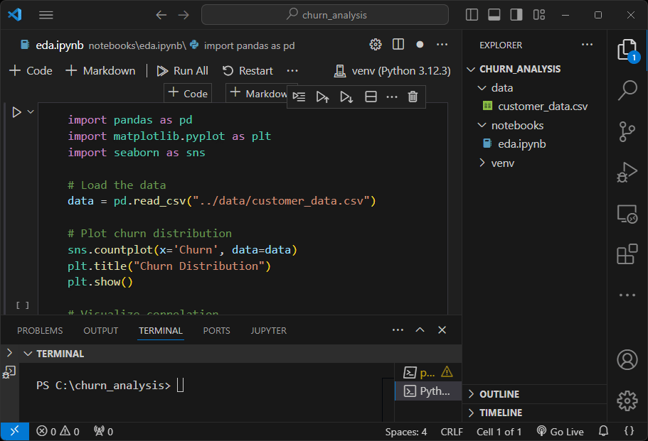
50,41,22,75.0,Month-to-Month,Noeda.ipynb – Exploratory Data Analysis
Purpose
The Jupyter Notebook performs exploratory analysis to uncover patterns and trends in the data. It:
- Visualizes churn distribution, correlations, and feature behavior.
- Provides insights that guide model building and business decisions.
The full code is at the end of this article…
Code Explanation
Loading the Data
import pandas as pd
import matplotlib.pyplot as plt
import seaborn as sns

# Load the data
data = pd.read_csv("../data/customer_data.csv")
This step imports necessary libraries and loads the dataset.
Plot Churn Distribution
sns.countplot(x='Churn', data=data)
plt.title("Churn Distribution")
plt.show()- Purpose: Visualize the proportion of churned vs non-churned customers.
- Insight: Helps understand if the dataset is imbalanced.
Analysis
— A balanced dataset as shown below is good for machine learning models, as it avoids bias toward the majority class. In imbalanced datasets (e.g., one class has far more examples than the other), models often favor the majority class, reducing their ability to predict the minority class correctly.

Correlation Heatmap
correlation = data.select_dtypes(include=['number']).corr()
sns.heatmap(correlation, annot=True, cmap="coolwarm")
plt.title("Feature Correlation")
plt.show()- Purpose: Highlights relationships between numeric features, such as whether higher tenure correlates with lower churn.
- Insight: Identifies influential features.
Analysis
— Age and Tenure have a strong positive correlation (0.930.930.93). This suggests that older customers tend to have a longer tenure with the service.
— MonthlyCharges is weakly negatively correlated with Tenure (−0.38–0.38−0.38). This might indicate that customers who have been with the service longer tend to pay slightly lower monthly charges.
—CustomerID is a unique identifier for each customer, it doesn’t hold any intrinsic value or predictive power for the analysis.

Churn Rate by Age Group
age_bins = pd.cut(data["Age"], bins=5)
age_churn = data.groupby(age_bins)["Churn"].mean()
age_churn.plot(kind="bar", color="skyblue")
plt.title("Churn Rate by Age Group")
plt.xlabel("Age Group")
plt.ylabel("Churn Rate")
plt.show()- Purpose: Shows how churn rates vary by age group.
- Insight: Identifies age demographics with higher churn.
Analysis
— Retention Efforts: Focus on strategies to retain younger customers, as they are the most at risk of leaving. Consider understanding their preferences and pain points.
— Customer Segmentation: Tailor marketing or retention campaigns by targeting younger customers with more flexible contracts or promotions to address their needs.

Tenure Distribution by Churn
sns.histplot(data=data, x="Tenure", hue="Churn", multiple="stack", bins=20, palette="coolwarm")
plt.title("Tenure Distribution by Churn")
plt.xlabel("Tenure (Months)")
plt.ylabel("Number of Customers")
plt.show()- Purpose: Compares tenure distributions between churned and non-churned customers.
- Insight: Reveals patterns, such as whether long-tenure customers are less likely to churn.
Analysis
— Early Retention: Focus retention strategies on new customers within their first 20 months. This might include welcome programs, personalized onboarding, or early engagement tactics.
— Loyalty Rewards: Incentivize long-tenured customers to remain, as they are already less likely to churn but may benefit from loyalty programs.

Monthly Charges by Contract Type
sns.boxplot(x="Contract", y="MonthlyCharges", data=data, hue="Contract", palette="Set2", dodge=False)
plt.title("Monthly Charges by Contract Type")
plt.xlabel("Contract Type")
plt.ylabel("Monthly Charges ($)")
plt.legend([], [], frameon=False)
plt.show()- Purpose: Examines how contract type affects monthly charges.
- Insight: Identifies high-value contract types.
Analysis
— Month-to-Month customers may be more price-sensitive, so focusing on competitive pricing or offering incentives to convert them to longer-term contracts could help retain these customers.
— Higher variability in long-term contracts suggests that these plans may include a wider range of features or services, potentially appealing to different customer segments.

Feature Importance
importances = model.feature_importances_
features = X.columns
plt.barh(features, importances, color="teal")
plt.title("Feature Importance")
plt.xlabel("Importance")
plt.ylabel("Feature")
plt.show()- Purpose: Visualizes which features contribute the most to the model’s predictions. Higher importance scores indicate more influence on whether a customer churns.
- Insight: Identifies key factors driving churn, guiding further analysis or business decisions.
Analysis
— Focus on tenure-related retention strategies. Offering loyalty programs or perks to new customers early on can encourage longer tenure and reduce churn.
— Address age-specific churn by targeting younger customers with tailored marketing or benefits that match their preferences.
— Evaluate pricing strategies to better align monthly charges with customer expectations.

Full Notebook Code:
import pandas as pd
import matplotlib.pyplot as plt
import seaborn as sns

# Load the data
data = pd.read_csv("../data/customer_data.csv")

# Plot churn distribution
sns.countplot(x='Churn', data=data)
plt.title("Churn Distribution")
plt.show()

# Visualize correlation
correlation = data.select_dtypes(include=['number']).corr()
sns.heatmap(correlation, annot=True, cmap="coolwarm")
plt.title("Feature Correlation")
plt.show()

# Convert 'Churn' to numeric (1 for "Yes", 0 for "No")
data["Churn"] = data["Churn"].apply(lambda x: 1 if x == "Yes" else 0)

# Analysis 1: Churn Rate by Age Group
age_bins = pd.cut(data["Age"], bins=5)
age_churn = data.groupby(age_bins, observed=False)["Churn"].mean()
age_churn.plot(kind="bar", color="skyblue")
plt.title("Churn Rate by Age Group")
plt.xlabel("Age Group")
plt.ylabel("Churn Rate")
plt.show()

# Analysis 2: Tenure Distribution by Churn
sns.histplot(data=data, x="Tenure", hue="Churn", multiple="stack", bins=20, palette="coolwarm")
plt.title("Tenure Distribution by Churn")
plt.xlabel("Tenure (Months)")
plt.ylabel("Number of Customers")
plt.show()

# Analysis 3: Monthly Charges by Contract Type
sns.boxplot(x="Contract", y="MonthlyCharges", data=data, hue="Contract", palette="Set2", dodge=False)
plt.title("Monthly Charges by Contract Type")
plt.xlabel("Contract Type")
plt.ylabel("Monthly Charges ($)")
plt.legend([], [], frameon=False)  # Optional: Removes the redundant legend
plt.show()

# Analysis 4: Feature Importance Plot (Assuming a Trained Model)
# Example: Random Forest model feature importance
from sklearn.ensemble import RandomForestClassifier
from sklearn.model_selection import train_test_split

# Prepare data for modeling (drop non-numeric and target column)
X = pd.get_dummies(data.drop(["Churn", "CustomerID"], axis=1), drop_first=True)
y = data["Churn"]

# Split the data
X_train, X_test, y_train, y_test = train_test_split(X, y, test_size=0.3, random_state=42)

# Train a Random Forest model
model = RandomForestClassifier(random_state=42)
model.fit(X_train, y_train)

# Feature importance plot
importances = model.feature_importances_
features = X.columns
plt.barh(features, importances, color="teal")
plt.title("Feature Importance")
plt.xlabel("Importance")
plt.ylabel("Feature")
plt.show()
Thank you for reading this article. I hope you found it helpful and informative. If you have any questions, or if you would like to suggest new Python code examples or topics for future tutorials, please feel free to reach out. Your feedback and suggestions are always welcome!
Happy coding!
C. C. Python Programming
You can also find this article at Medium.com